
Could a fresh paint job affect your mood and mindset? It might. People have long associated color with emotion, meaning the hues you surround yourself with may influence your psychology.
Knowing this adds a new wrinkle to interior decorating, but learning the same tricks marketers use to influence buying behavior lets you create a unique vibe that says, “I’m home.” Consider the following when choosing paint hues to improve your outlook and influence your mood.
Factors To Consider When Choosing Interior Color
You’re not imagining things if light blue walls induce a sense of calmness or relief, just as pops of yellow may spark joy. Many people choose to fill their homes with color for this reason. However, other qualities outside of psychology may influence your choice of hue. Here are three factors to consider when choosing interior colors.
1. Room Size
Lighter shades make a small space look bigger. However, it doesn’t mean you shouldn’t include bolder hues in your home. When selecting a dark color for a tight space, utilize mirrors across from windows and doorways to create a roomier feel.
2. Available Lighting
Today’s LED lighting modifies your interior ambiance without repainting. For example, renters can escape bland “greige” by using strip lights below cabinets and furniture to create a different colored glow.
3. Room Purpose
You may turn to paint to create a sunny, spirited vibe for your kitchen but a serene, relaxing tone for your bedroom.
Understanding Color Qualities
Each hue is a rainbow assortment of various gradients, and the temperature and intensity of the scheme you choose often matter as much as the shade itself.
1. Color Temperature
Warm shades with reddish or yellow undertones elicit a cheerful, extroverted vibe. Conversely, cooler undertones create a more serious, serene and relaxed atmosphere.
As such, many people avoid cooler undertones for the kitchen, which can make the space feel cold and unwelcoming. However, using a cool shade in the primary bedroom may ease you into a restful slumber.
2. Color Intensity
Color intensity refers to the depth of the primary hue and influences its strength. For example, bright primary reds and yellows used in playground equipment reflect children’s overflowing energy. Meanwhile, a pale canary yellow kitchen invites you to linger a while.
Financial institutions also use deep blue tones to convey stalwart trustworthiness, whereas yoga studios might favor pastels or neutral shades.

9 Interior Hues And Their Impact On Your Mood And Psychology
You stand in the paint department before a dizzying array of swatches in every hue, intensity and temperature imaginable. How can you narrow your choice further? Let’s examine how specific interior colors impact your mood and psychology.
1. White
White has long represented purity, a clean slate and possibility. It’s a backdrop for other colors but can look austere without artwork to break up the monotony.
2. Gray
Although gray is neutral, it’s also halfway between white and black. As such, it creates security, balance and harmony. It also offsets more striking hues and generates more profound relaxation when paired with cool bedroom tones.
3. Browns
Brown reflects the natural world. However, like white, it can seem overly austere when uninterrupted by other shades. It’s best to break up brown with an artistic photo collection or a singular piece of art.
4. Reds
Red is a high-energy color but can quickly become anger-inducing when used excessively. Bright reds work best as an accent color against neutral tones. Likewise, deeper magenta tones evoke refined tastes, while pinks exude a sunny, childlike aura.
5. Blues
Blue promotes tranquility, making it a popular choice for bedrooms. Lighter blues make rooms airy like the open sky, while darker hues exude the silent serenity of ocean depths.
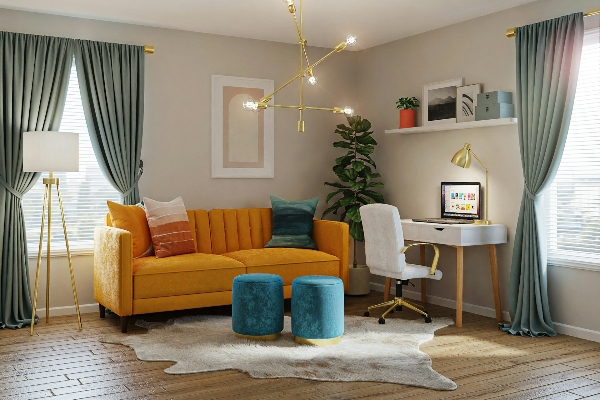
6. Yellows
Yellow is reminiscent of the sun’s rays. It’s a lively, warm and happy color in kitchens, living spaces and children’s playrooms.
7. Greens
Like gray, green represents harmony and balance but with warm undertones. It helps ease stress without zapping your energy and stimulates freshness.
8. Oranges
Orange marries red’s high energy with yellow’s optimism. However, it’s also often used to represent a need for caution, so use it sparingly as an accent color or to bring some warmth to otherwise neutral spaces.
9. Purples
Purple is warmer than blue — its deep, intense tones denote royalty and formality. However, lighter lavender hues blend well with green to create a relaxed, confident ambiance.
Your Home’s Interior Hue And Your Mood
Do you need a fresh coat of paint to match your new outlook on life? Understanding how hue affects your mood lets you choose your home’s interior paint with psychology in mind. Through the magic of color science, you can create the mood you want in each room.
 Author Bio
Oscar Collins is the editor-in-chief at Modded, where he writes about health, fitness and more. Follow him on Twitter @TModded for regular updates on his work.